Diagnosing the system behind a 0.48% conversion rate
- Context
- An online pharmacy converting at 0.48%, with no shared account of where customers were leaving or why.
- Position
- Internal operator
- Role
- Senior E-commerce Marketing Specialist. Scope: purchase-journey diagnosis, cross-functional facilitation, service redesign, and the website experience through to build.
- What I owned
- The diagnosis, the roadmap, the business recommendations, and the website experience.
- Worked with
- Managing Director · Finance · Operations · Marketing · Web Development
- Method
- Journey mapping · Behavioural data analysis · Competitor benchmarking · Stakeholder mapping · Service blueprint · Facilitation
- Outcome
- Conversion from 0.48% to 1.81% over my first year. Checkout completion time down by 87%.
The starting condition
The online pharmacy converted at 0.48%. The business knew it was underperforming. What it lacked was a shared account of where customers were leaving or why.
My title was e-commerce marketing. I had no mandate to redesign anything. What I had was access to the behavioural and performance data, the competitor set, and the people whose decisions were shaping the experience.
My first hypothesis was wrong
I started where my remit pointed: campaigns to bring more traffic, and a better-looking site to convert it. A marketing and visual design problem.
The evidence didn't support it. Traffic wasn't the constraint and appearance wasn't what customers were struggling with. What I was looking at was a purchase journey assembled out of decisions taken separately, in four different functions, none of them made with the customer in the room.
That reframe is the reason anything here worked.
What I investigated
I mapped the purchase journey against behavioural and performance data to locate where customers were dropping out, and benchmarked pharmacies across the local market, UAE, and Saudi Arabia to establish what customers had already been taught to expect elsewhere.
The friction points sat across Marketing, Finance and Operations, but ownership of a problem did not always come with the authority to change the decision behind it. Several recommendations would require one function to give something up for the end-to-end journey to improve.
I mapped the stakeholders on two layers: ownership and decision authority, then used cross-functional working sessions to make those trade-offs explicit. Marketing, Finance, Operations and Web Development worked through the journey together; where a decision sat above a function's mandate, the Managing Director joined the relevant session so it could be resolved at the appropriate level. Before those sessions, I briefed the Managing Director one-to-one, so each trade-off arrived already understood and the session could focus on deciding it.
That put each decision in front of the people who could actually make it, while keeping the customer journey visible across functions. It gave the team a shared view of the trade-offs and created the basis for one prioritised roadmap rather than four departments solving their parts independently.
What I found was a service design problem: every frontstage friction traced to a backstage decision
This is the service blueprint layer, the symptoms customers met, and the internal decisions producing them.
| Frontstage | Backstage |
|---|---|
| Forced account registration at checkout | Marketing's database growth objective Marketing |
| Delivery priced above the market | Finance pricing to recover fulfilment cost, without reference to what competitors charged Finance |
| Expected payment methods buried in later steps | The provider's checkout architecture Payment provider |
| Homepage led by products the business prioritised | Internal priorities, not customer demand Business |
Each function had made a defensible decision. Together they produced a journey nobody had designed and nobody owned.
The roadmap
I translated the findings into one prioritised cross-functional roadmap, sequenced with the commercial and operational owners who would carry each item.
- MarketingRemoved mandatory registration at checkout
- FinanceMoved delivery to a flat fee in line with the market, with free delivery from 89 QAR
- OperationsContracted a delivery company to add fleet capacity
That roadmap is what made the next part possible. Each function could see what it was being asked to give up, and what it was getting in return from everyone else.
What I had to win
Merchandising — from what we wanted to sell to what customers were buying. The company had built the site around a defined set of products it had decided to push. The behavioural data said demand sat elsewhere, and my benchmarking showed competitors organising around how customers search rather than around in-house ranges.
The cost was real: the homepage would no longer guarantee visibility to products the business had committed to. I won it on perception rather than conversion; competitors weren't foregrounding their own ranges, and a catalogue arranged around what we wanted to sell would teach customers our range was narrow. That cost compounds.
The payment provider. The business judged checkout on whether it worked. I argued the test was whether it matched what customers had already been taught to expect, because competitors sharing our market had set that standard.
Our provider broke it in a specific way: a customer wanting Apple Pay or Google Pay had to select "card" first, then find their method on a later step. The options existed and the site said so, but they sat behind a sequence customers didn't expect, at the exact moment they were deciding whether to finish. I evidenced it two ways — market intelligence on how competitors structured the same steps, and direct observation inside the company, watching colleagues from other departments move through checkout and seeing where the sequence confused them.
The provider agreed the structure could change but needed time. Management changed provider instead. The provider later rebuilt that flow and re-approached the company.
Delivery repricing. Delivery was priced by location, with separate standard and express rates. Competitors charged a flat 10 QAR for both, with free delivery from 99 QAR. I recommended reducing the fee, moving to a flat rate in line with the market, and introducing a free-delivery threshold. Finance set the figures — and went further than the market, with free delivery from 89 QAR. The company gave up fee income in exchange for higher order value and completed baskets.
Registration. Marketing gave up mandatory account creation at checkout, and with it the database growth the requirement existed to produce.
Turning the recommendations into the experience
Recommendations only matter once customers can feel them. So I carried mine into the experience itself — sketching the flows, mocking up screens in Figma and Photoshop, writing the requirements for each change, and working them through with the development team until they shipped. Some changes I designed end to end; others I identified and directed, and the developers built.
- Checkout. I redesigned the purchase path and removed forced registration, cutting checkout completion time from around three minutes to seconds — an 87% reduction.
- Search. I found that misspelled searches returned nothing and directed the fix, so a customer who mistypes a product name still finds it.
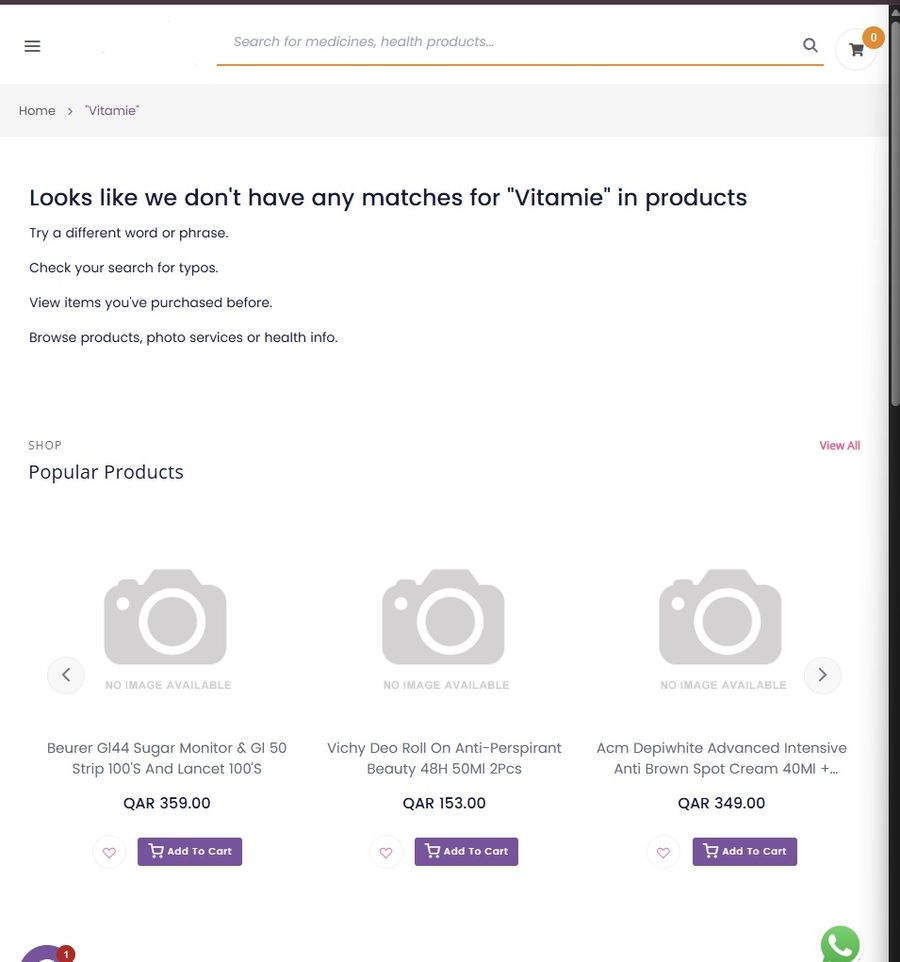
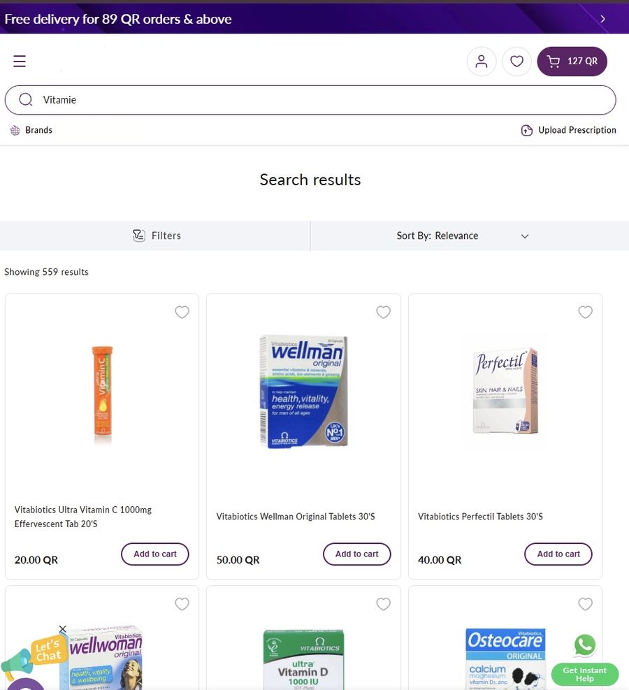
- Information architecture. Main navigation, menus, the offers section, and how many products a customer sees before scrolling, rebuilt around demand.
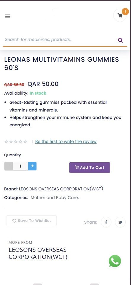
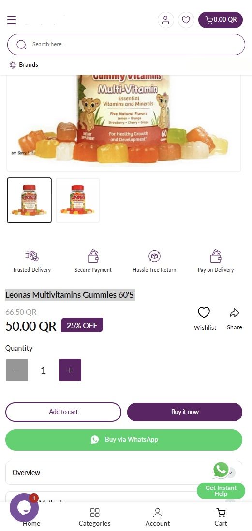
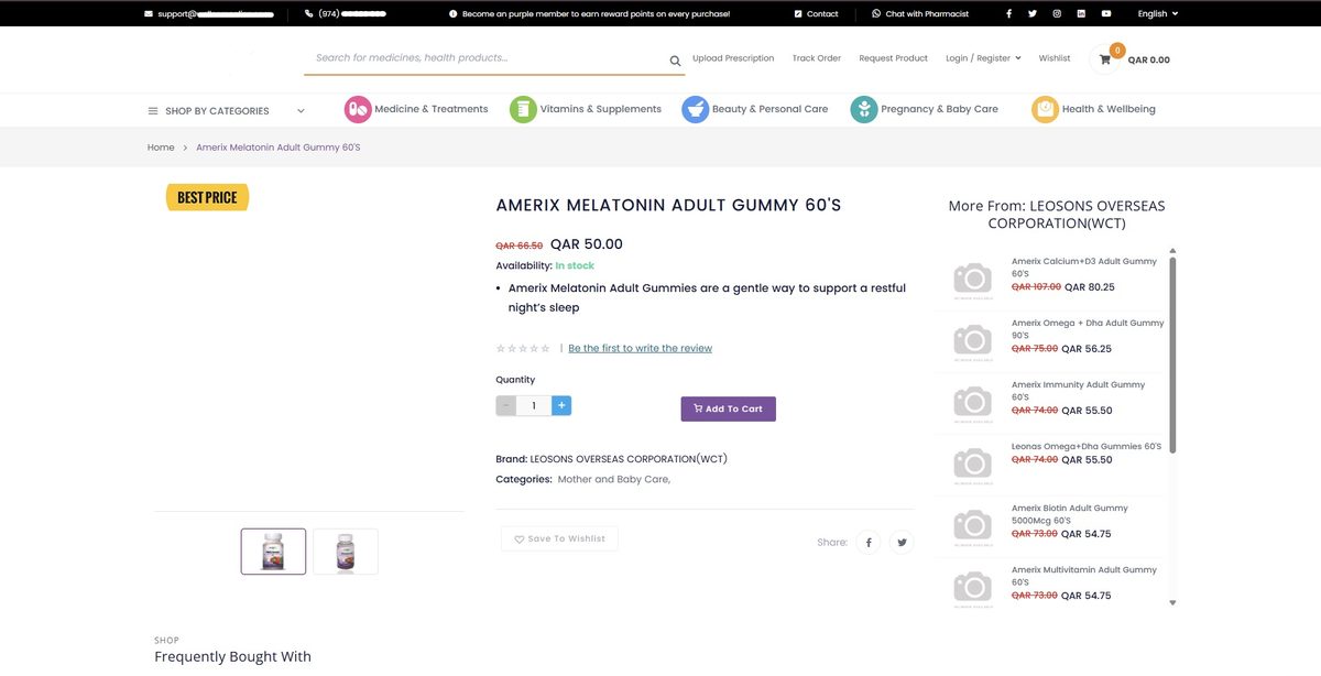
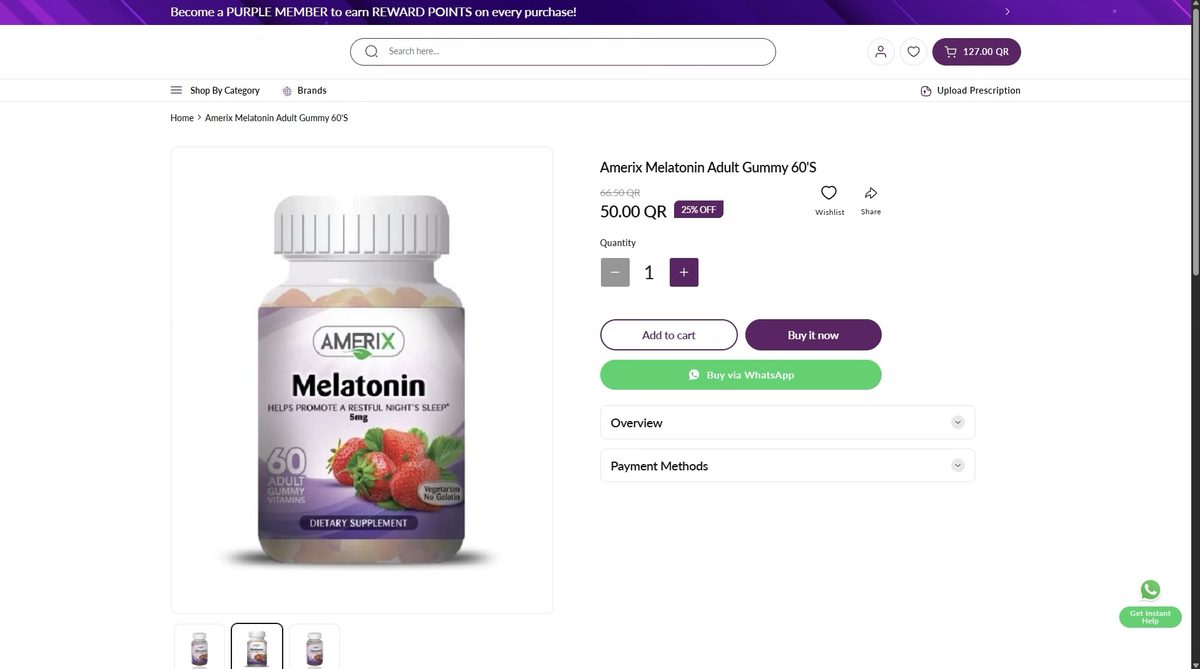
- Product experience. I restructured the product page: trust signals up front, product information organised into clear sections — overview, how to use, payment methods — visible payment options, and reviews.
- The free-delivery mechanic. A progress indicator showing customers how much remained to qualify, turning Finance's pricing rule into a reason to increase the order value.
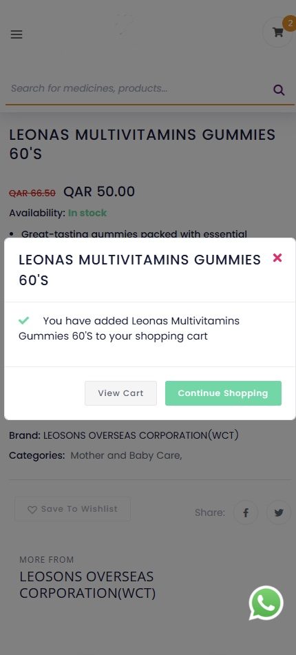
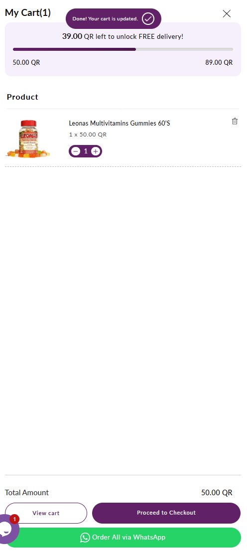
- Cross-sell. A "You May Also Need" section in the cart, placed where customers are already committed. It works as a pair with the progress indicator: one tells the customer how far they are from free delivery, the other gives them something to close the gap with.
- Order instructions. A pharmacy order often carries something the product page can't — extra ice for insulin, a second number for the delivery driver, a note for the pharmacist. I designed the field from the ground up and specified it through to implementation.
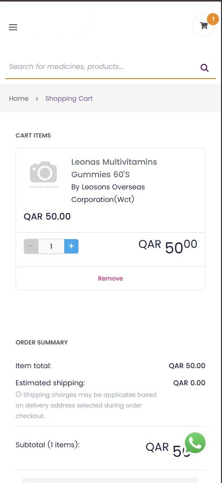
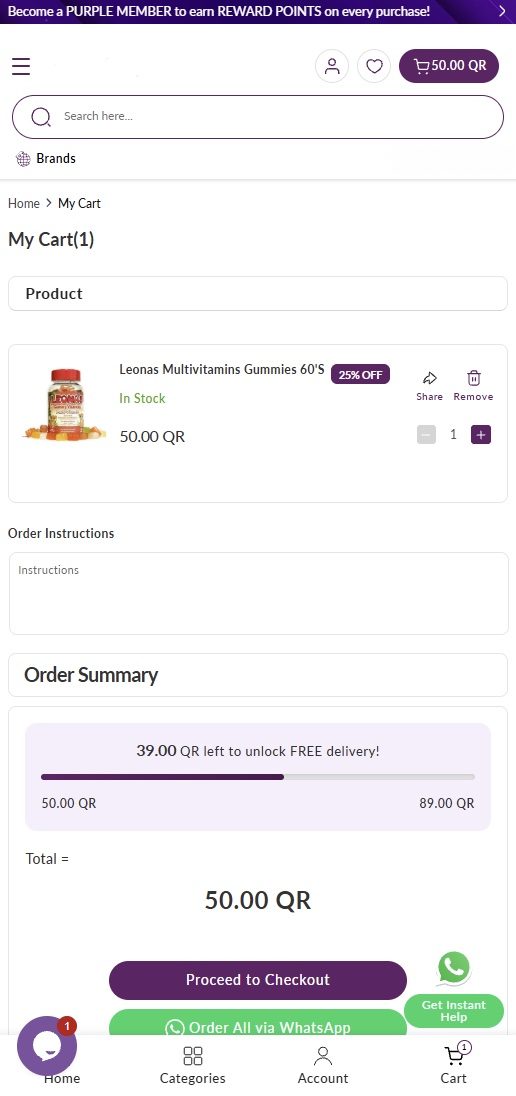
- The rest of the site. Cart, header, footer, blog, action button design and placement, post-order messaging.
- Mobile. The old site shrank the desktop layout to fit a smaller screen without changing the experience. I designed it for the phone: primary actions within thumb reach, a bottom navigation bar, and trust signals placed before the purchase decision.
Evidence and limits
What I owned, and what I didn't
The service spans payment infrastructure, delivery economics, fleet capacity, fulfilment, marketing's database objectives, the website and merchandising. I didn't own that system.
What I owned was the diagnosis, the roadmap, the business recommendations, and the website experience. Everything else moved because the people who did own it agreed to move, which is the harder half, and the part that took the most work.
What I'd do differently
I'd give problem definition more of the time I gave to solutions. I arrived at the right frame by working through the wrong one first, and the mistake was spending months solving the wrong problem.